Great Designs Make Great Brand!! Get your product promoted by unique designs
A few days ago I went to the big bazaar with a friend. While hanging near the snack shelves she suddenly picked up 5-6 packets of fryums. We girls are on diet and this insane added this much packets to the cart. I asked have you ever tasted this before. You are buying 6 packets. And she was like “see, packet accha dikh rha hai to product accha hoga na” and suddenly I remember that the first impression is the best impression!!
Who wants a lifeless and boring brand? Research has shown that people are more attracted to the packaging designs and they want a product that looks good. It is said that consumer takes around 7 seconds to decide whether to put a product in a cart or keep as it is on the shelf. Your packaging designs create an impact on the minds of customer and the high number of customers (and my friend too!) have tried product only because of its packaging look and designs. So it is the first impression that persuades customers to buy products. So we can say that your product packaging and designing represent your brand. If your sale volume is not going up to your expectations mark despite having a fantastic product you may have to redesign your product designs and packaging because the packaging is your best marketing manager! A successful packaging design gives you competitive advantages in the market.
What is trending in packaging designs?
● Bold colours
Isn’t bold colours are an eye-catcher? If you want to stand out your product on the shelf of a retail shop, you can go for bright and bold colours in flexible laminates. Snacks and wafers manufacturer have such vibrant colours and these products can be easily spot on the shelf. Once I saw the old lady was buying a bright red package and she doesn’t even know the name of the brand and in this way, Rural area customers have a huge attraction toward these FMCG products. These bold and bright colours can give the face to your products and people who cannot read your brand name, easily recognize your brand through your unique bold colour combination. Basic yet effective marketing strategy!
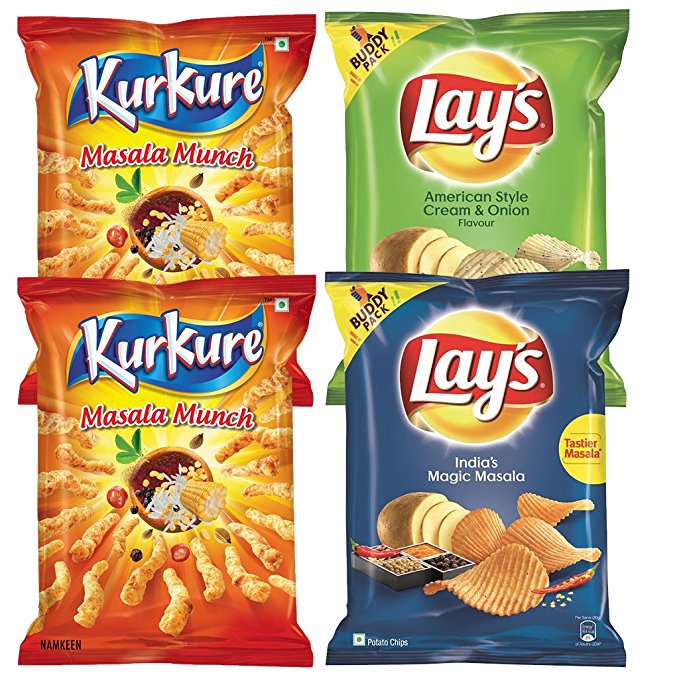
● Matte lamination with spot treatment
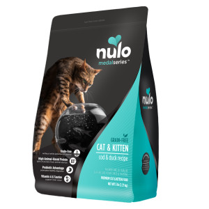
The matte finish is now mostly preferred and ‘fashionable’ choice for laminates in packaging. This finish does not reflect light from the surface of the pouch and therefore do not have a lot of shine. Finishing of the pouch is silky and smooth to touch. Matte finish treatment can make text easier to read and increase the appeal of the product. This on-trend design element offer benefits to your products. Scratches and scuffs are more readily absorbed by matte lamination so imperfection is hard to spot on the package.
Less reflective packaging in the brightly lit store helps eyes settle on your brightly designed logo or another key marketing element of your choice. Your logo is highlighted through spot lamination using thin plastic film over the glossy surface and of course, matte finish looks sober yet elegant and luxurious.
Less reflective packaging in the brightly lit store helps eyes settle on your brightly designed logo or another key marketing element of your choice. Your logo is highlighted through spot lamination using thin plastic film over the glossy surface and of course, matte finish looks sober yet elegant and luxurious.
 |
 |
● Gloss lamination
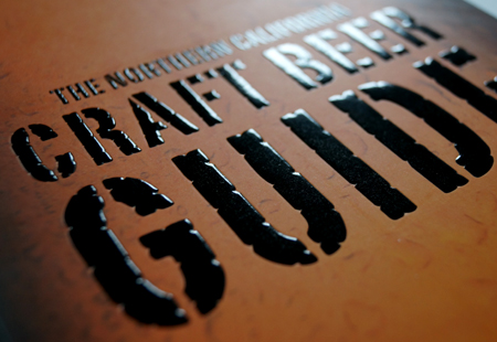
Gloss laminations have stunning looks. This lamination is contrasting with matte lamination. Gloss has lustrous quality as light reflects from surface and implant richer product and makes dull surface pops! This kind of laminates is durable as they repel dust, dirt, and fingerprints. It is easily wiped clean. There are even gloss laminates made specifically for thermal transfer printing; their smooth finish is designed to provide high-quality print results with fewer expenses.
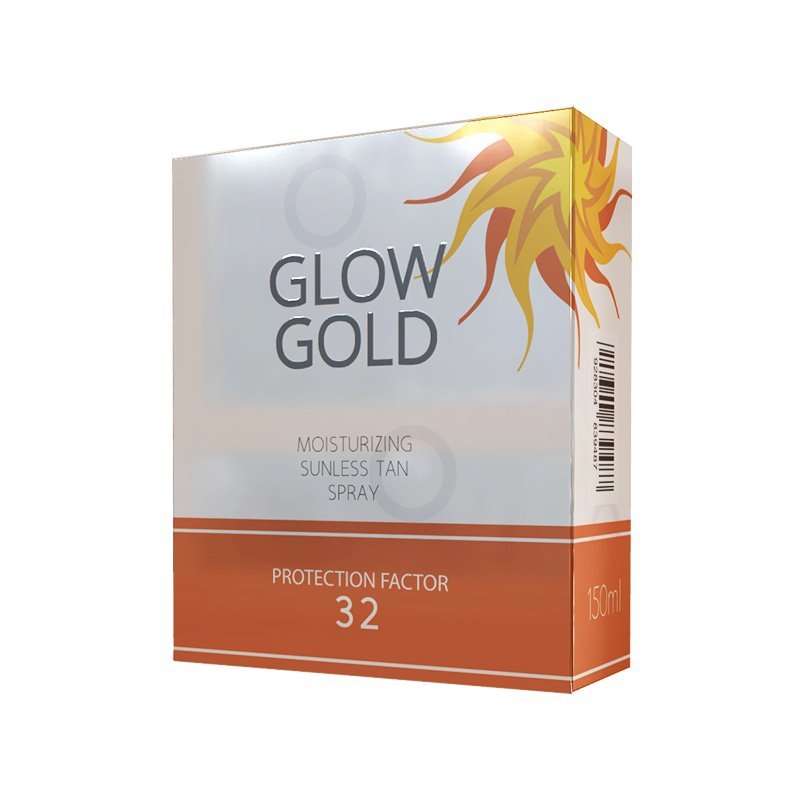
● Good Graphics
Graphic design is an important tool that enhances how you communicate with other people. It serves to convey your ideas in a way that is not only effective but also beautiful. Packaging designs require graphic designs to convey a message clearly and one picture speaks more than a thousand words! Graphic designers are trained professionals who understand the technique to persuade, engage, and entertain the audience using various elements. They can combine technology and art to communicate a message.
Good Photography is also the key part of advertising and branding. Photographic images capture an emotion. If you see the happy picture of baby bathing with mild soap, you want that soap to make your kid happy in turn.
Photography is essential to the graphic designer in diverse ways since images can mean a lot in communication as far as aesthetics are concerned.
What are the problems with packaging designs?
Nowadays purely profit-oriented brands forget to convey the emotional message to the customers. Emotional touch which touches the heart of customers makes customers to buy that product. You can see the example of Cadbury celebration. Cadbury’s celebration premium package design and heart whelming message make the particular brand famous. Bad graphics is another example with problems in designing of packages and non-interactive package fails to attract the customer. Excess information printed on packages or at POS is a disaster. Customers won’t be able to read what is in the pack because there is too much information on it.
Another problem is with bad quality photographs in graphic design or stolen pictures from various sites using as their own. It surely makes your brand negligible.
Despite having everything in hand, a bad product design can ruin your sales because as we all know Jo Dikhta Hai Wo, Bikta Hai! There are some packaging design firms like pickNpack whose talented graphics team design your brand by keeping your uniqueness in mind and helps to boost your products.
So make an Impressive design for your product and makes your brand memorable in the minds of your customers.


Nice post, thanks for sharing with us
ReplyDeleteeco friendly paper | luxury apparel boxes | eco friendly packaging boxes India